Based on Hart's 1977 paper (Icarus, 33, 23-29 (1978)) on the Evolution of the atmosphere of the Earth, the one that puts the continuously habitable zone around the sun from about 0.95AU to 1.01AU.
Vertical scale : 2° per unit, compared with the baseline temperature of 15C
Horizontal scale : 330 ppm CO2 per unit (1977 baseline); the white line is for 2008, 387ppm.
JavaScript required for plotting the image.
A little exercise in feedbacks
The purple line shows the effect of CO2 by itself, as it increases the opacity of the atmosphere
τCO2, the optical depth being proportional to the square root of the amount of CO2, and ΔTGH = (( 1 + (3/4)τ)1/4 - 1)*0.43 * Tbase; where Tbase is 255K, and at the baseline water vapour has τH2O = 2.34, and τCO2 = 0.15, so a six-fold increase in CO2 gives about a 2° warming on average.
But wait! Warming will cause more water vapour in the atmosphere, going roughly as QH2O proportional to exp((T-288)*0.0698), plus τ also varies as T-1/4. Adding these in, we get the blue line, which is much more alarming.
But wait! Warming will melt ice (ice cover going as (328-T)5), but more water vapour will mean more cloud, going as QH2O. Both ice and cloud reflect heat, reducing Tbase. Figure those in, and we get the green line, where the cloud compensates for some of the CO2 warming, and all the extra water vapour.
Conclusion
The modelling is incredibly sensitive to the input assumptions, and the feedbacks that are implicit in those assumptions.
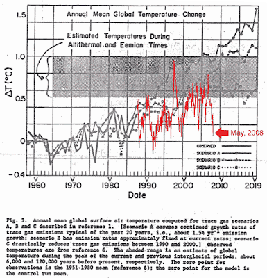
How good are the big-boys' models? Well, just look:

Link; and a simpler, punchier and more recent graphic here.
h/t the Devil